Even the neighbor’s dog stopped barking — John Deere mowers

Originally crafted at Brandfarm

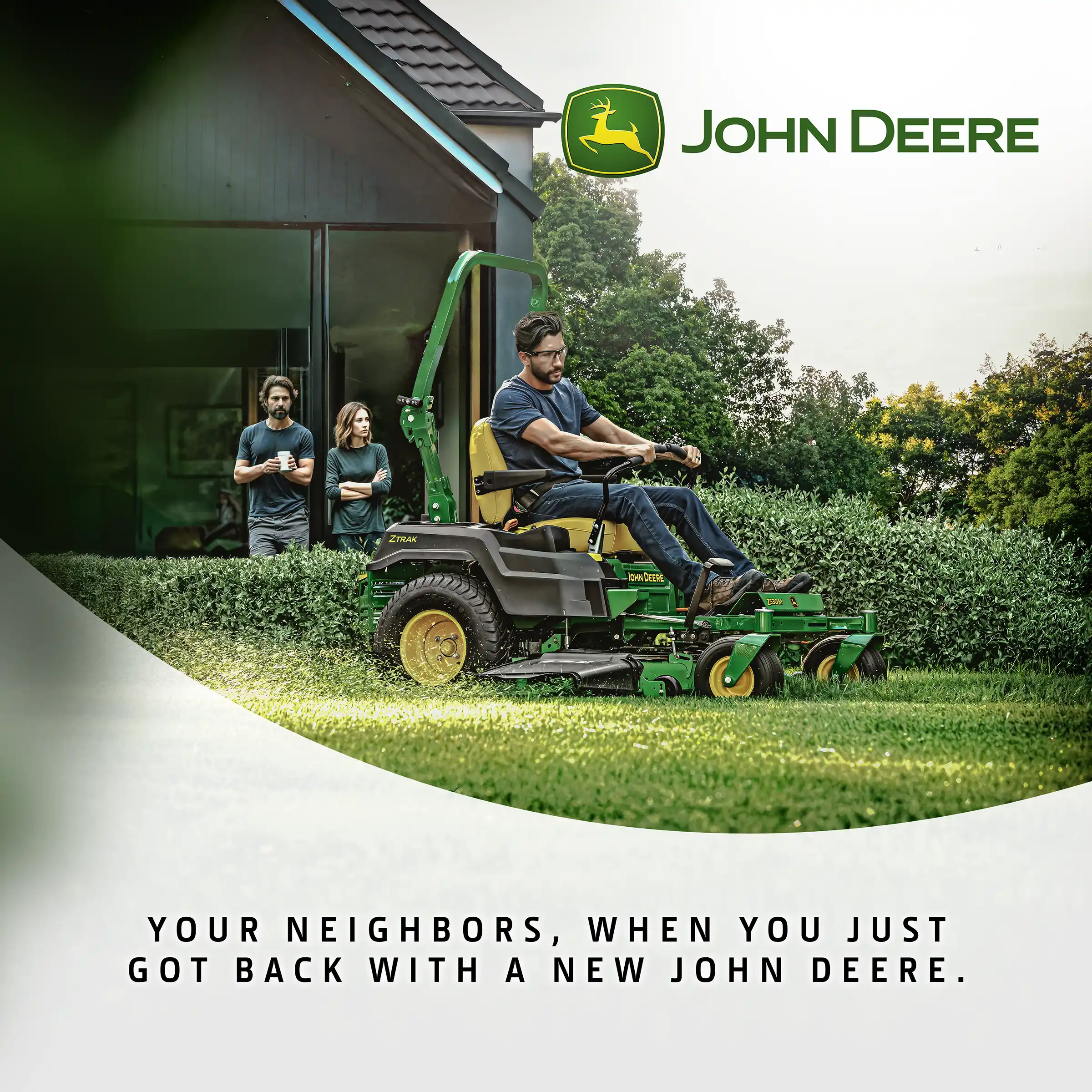
Nothing motivates a purchase quite like a neighbor’s jealousy. The campaign for John Deere proves that the best sales trigger can simply be the silence from the other side of the fence. Lush green, a perfectly trimmed lawn, and a touch of irony were enough to turn a simple mower shot into a story full of emotion — where everyone plays their part: the owner, the neighbor, and even his dog.

From a set of standard John Deere assets, a full series of visuals was created to portray everyday neighborhood moments in a humorous, relatable way. The work included concept development, photo manipulation, image compositing, and detailed retouching to seamlessly merge multiple elements into one coherent scene. Each visual was later paired with lighthearted memes that added a social twist to the campaign — turning simple product images into stories people could actually smile at. Concept, visual design, and post-production by Brandfarm.

Even the neighbor’s dog stopped barking

Made in Brandfarm

Made in Brandfarm

Made in Brandfarm

Made in Brandfarm

Behind the humorous concept lies a simple truth — emotions sell as well as specifications. Instead of focusing on power, speed, or performance, this campaign shows what truly makes people want a John Deere: the feeling of pride when everyone else stops and stares. Neighbor’s envy included with every John Deere mower.

Grab it or lose it — creative campaign for JD 6M clearance

Originally crafted at Brandfarm

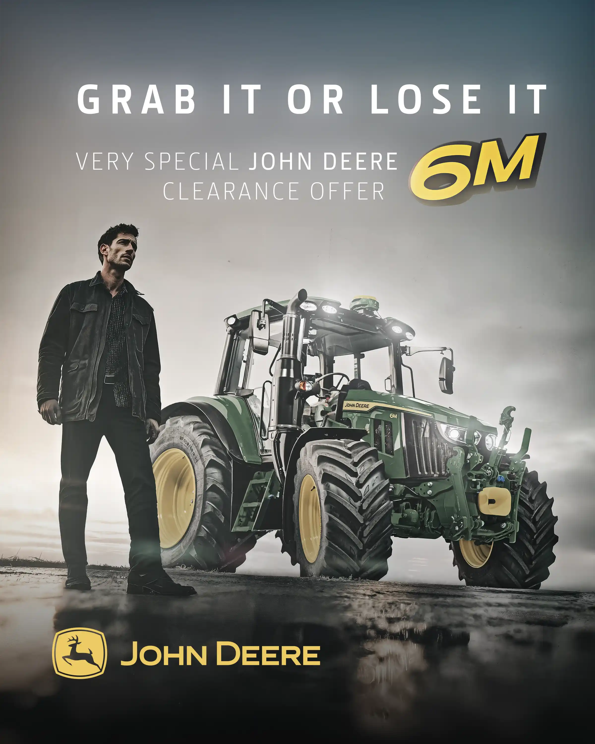
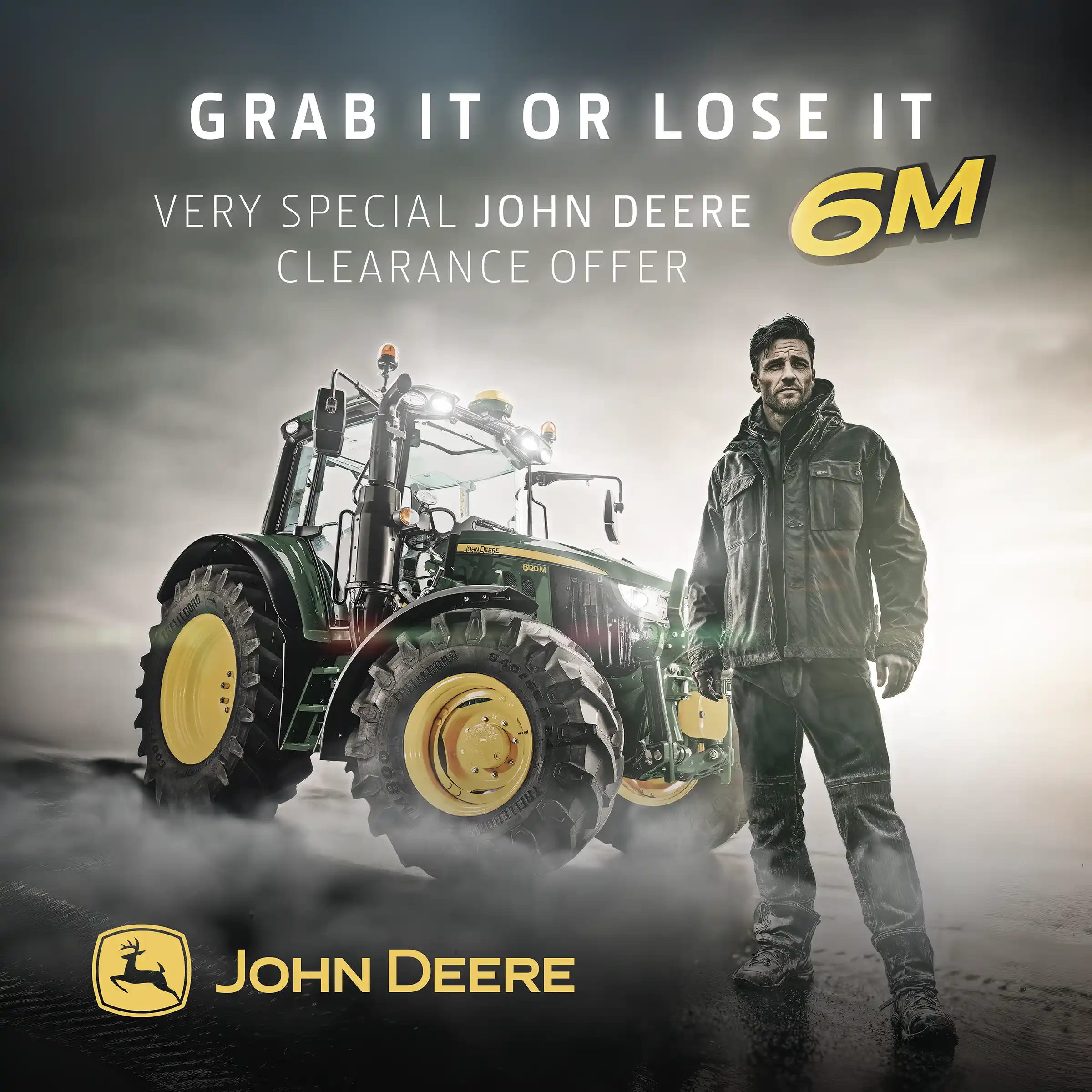
Every decision in business comes down to timing — and farming is no different. The John Deere 6M clearance campaign captured that fleeting moment between hesitation and action, where opportunity either slips away or becomes a victory. A cinematic composition, strong contrast, and a lone figure standing next to the machine created a scene that feels more like a movie poster than a product ad.

What began as a seasonal clearance push became a statement about confidence and instinct. Through light, posture, and atmosphere, the campaign invited farmers to see their purchase not as routine, but as a bold move — one that defines who leads and who follows.

The work combined concept development, visual design, and heavy post-production to turn standard product imagery into a dramatic storytelling piece. Created for the 6M series, it connected urgency with aspiration, reminding that some chances only come once. Grab it or lose it — creative campaign for JD 6M clearance.

Grab it or lose it

Made in Brandfarm

Made in Brandfarm

Made in Brandfarm

The John Deere 6M Clearance campaign turned a straightforward sales message into a cinematic expression of strength and precision. The composition — combining the 6M emblem, headline, subline, and the tractor itself — was designed to work like a movie poster, merging brand storytelling with visual impact. Through careful retouching, lighting, and atmosphere, the project captured that decisive moment between hesitation and action — when a purchase becomes a statement.

Each visual was meticulously crafted to highlight not just the machine, but the confidence behind the decision to own it. From art direction and photo manipulation to tone and composition, every frame was built to elevate a limited-time offer into an iconic moment.

Creative direction, visual design & retouching by Brandfarm — 2024.

For those who measure time in hectares — the 360° Rol-Ex experience

Originally crafted at Brandfarm

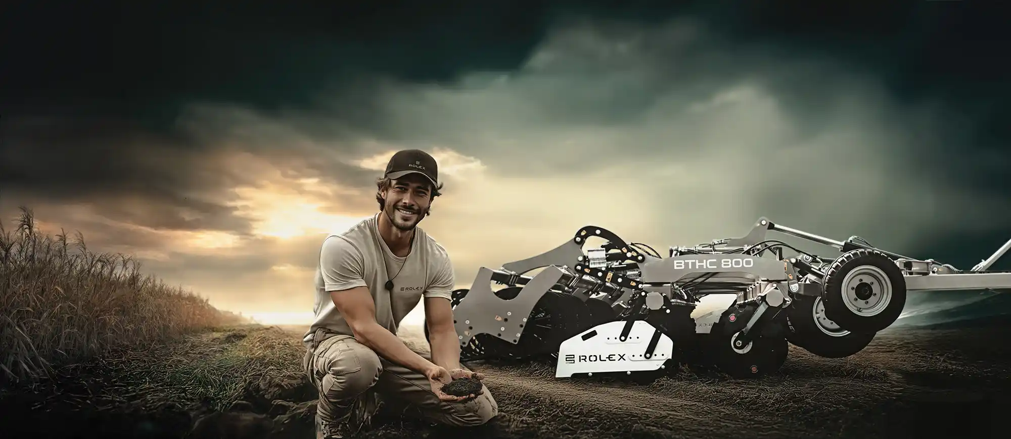
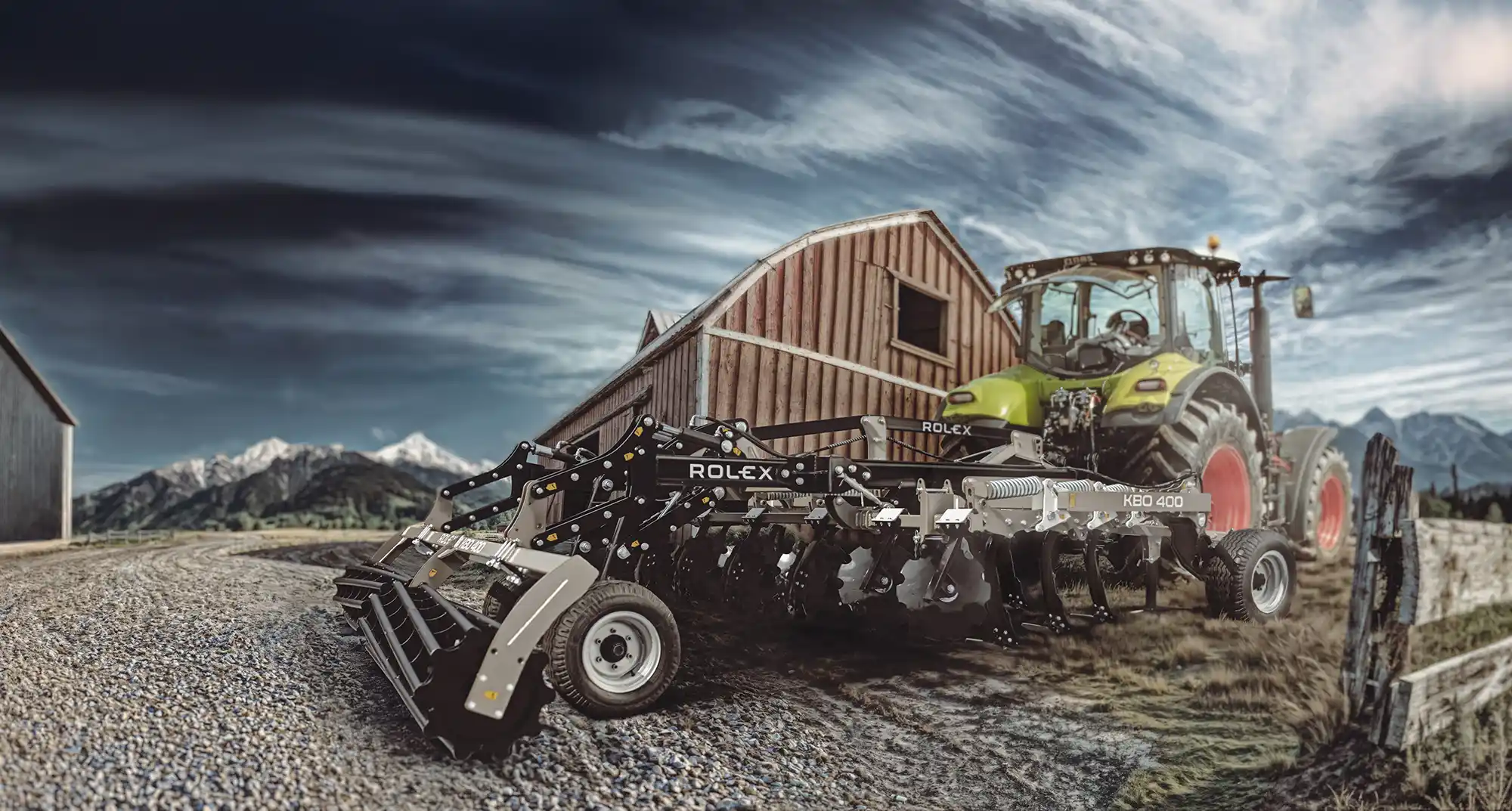
Rol-Ex, a Polish agricultural brand, proves that precision and innovation don’t stop at the Alps. Their signature cappuccino-colored machines stand out boldly in a world dominated by red, green, and blue — a symbol of courage and creative vision. A brand this confident deserves equally inventive storytelling — and that’s where we come in.

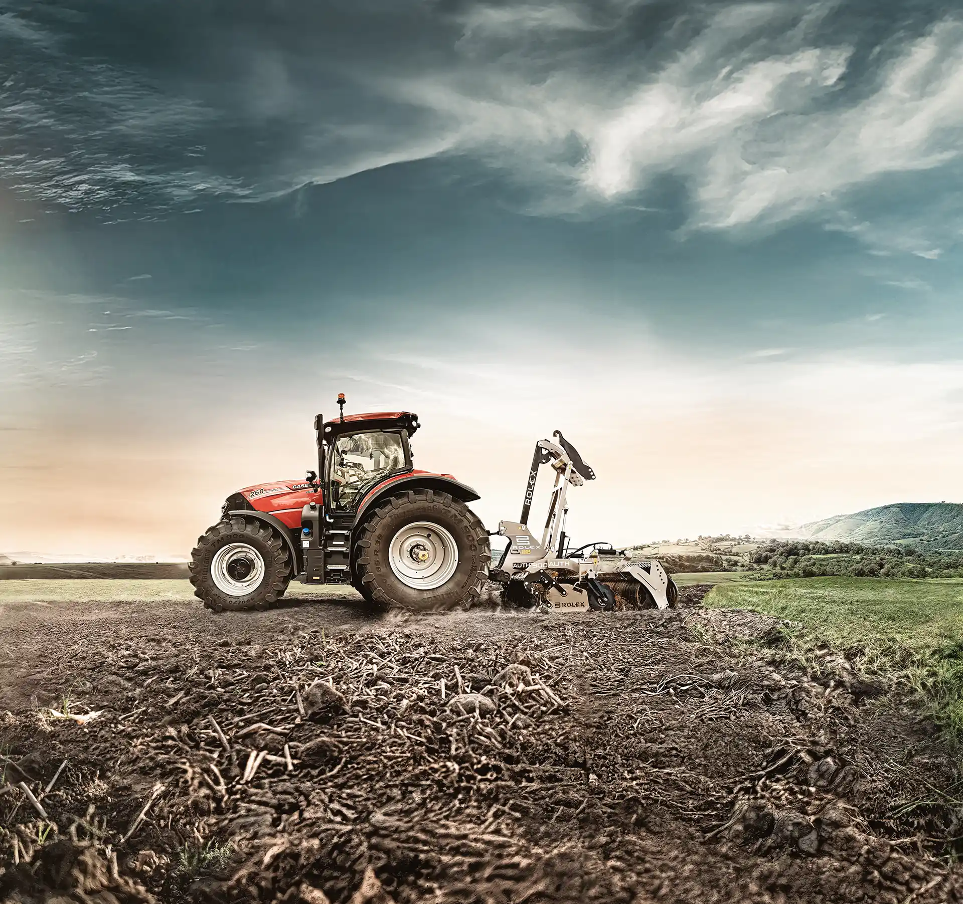
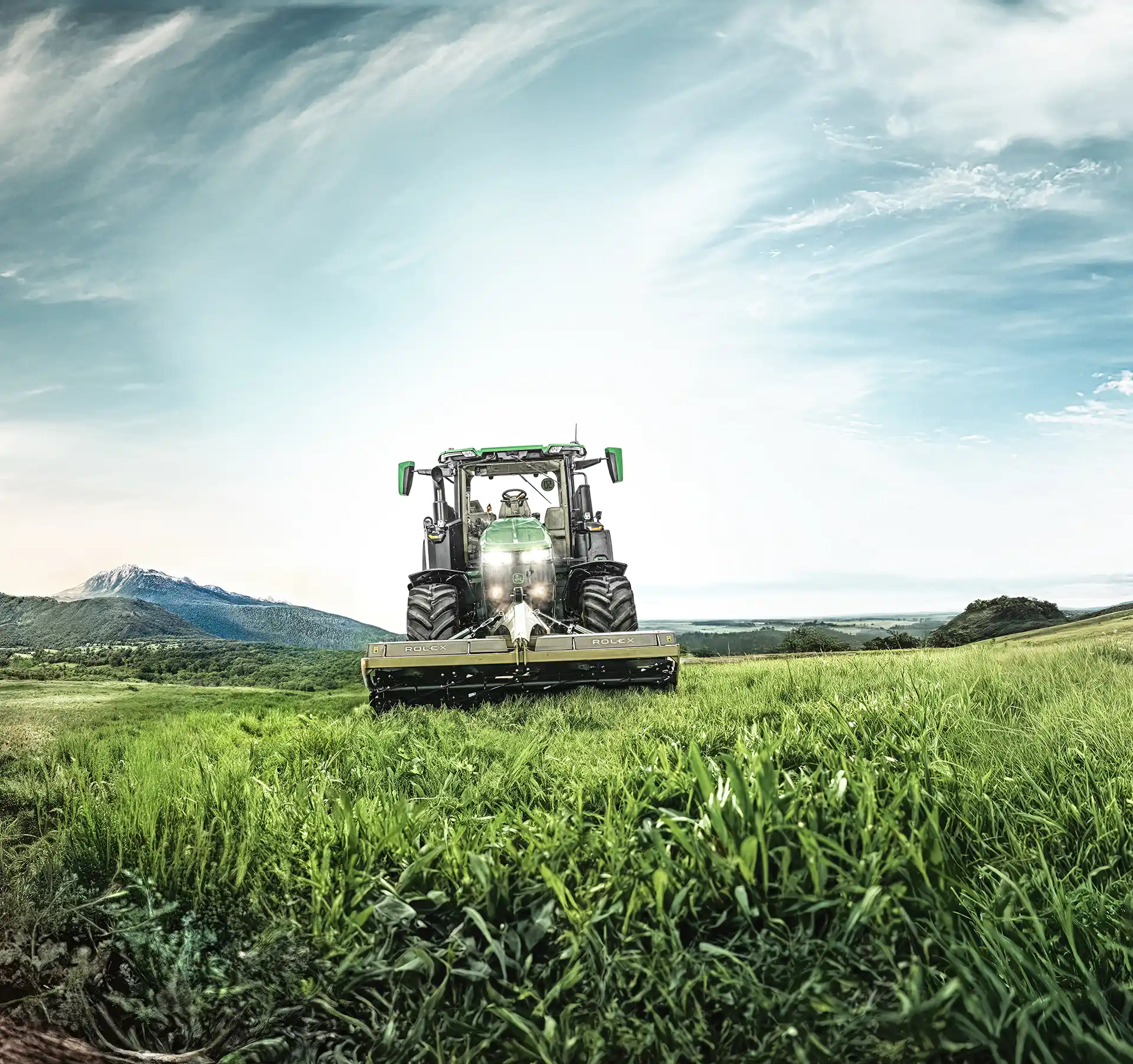
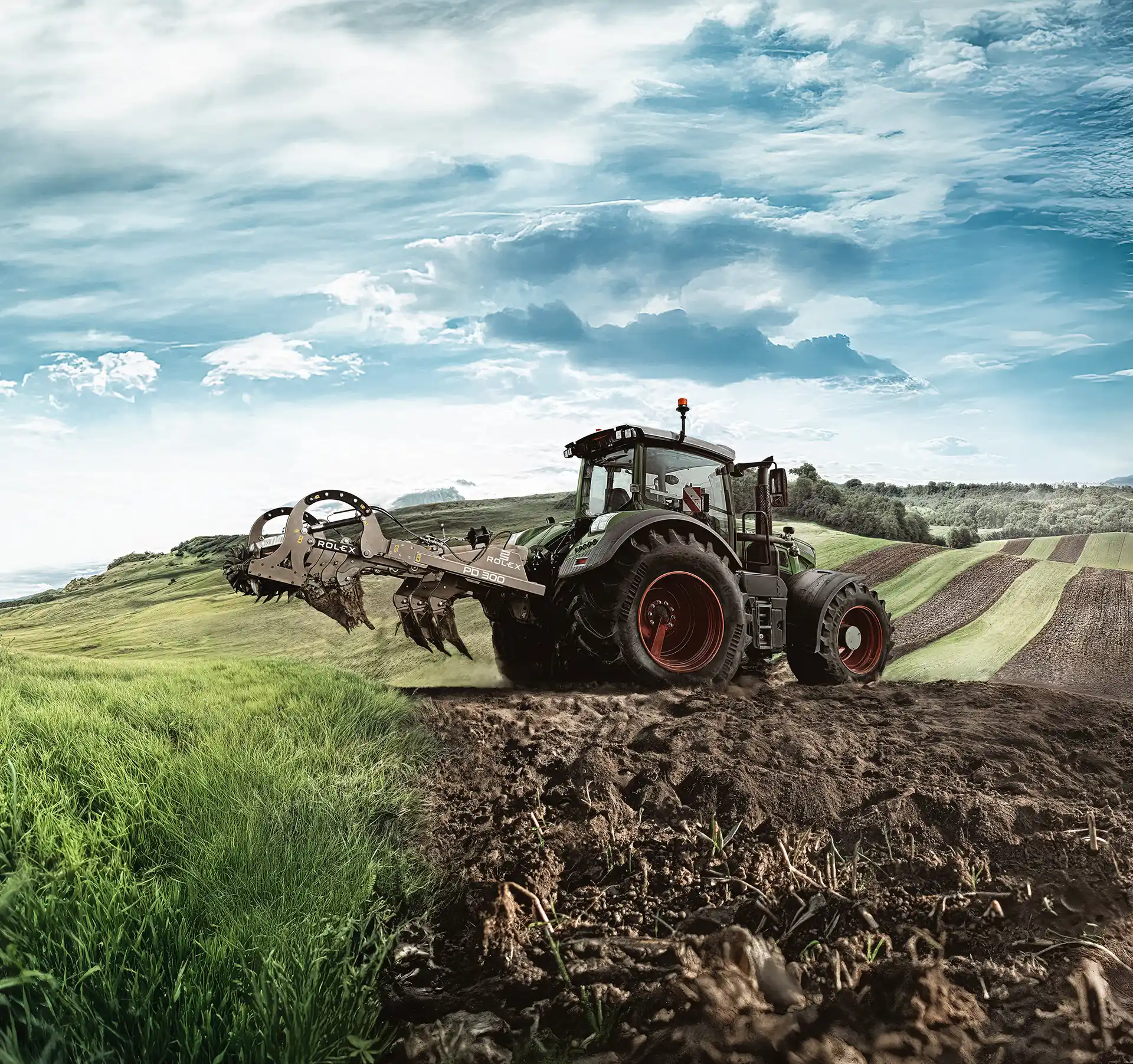
Move around — we’ve got nothing to hide. They say perfection has many sides — so we showed them all. For Rol-Ex, we built a cinematic 360° panorama — printed in a massive, high-resolution format as a wall mural for the brand’s trade show booth. The final artwork spanned nearly 40 feet (12 meters) in width, offering poster-level sharpness and depth — all created from surprisingly small assets, including a single frame taken from a TikTok reel.

The result exceeded expectations — both ours and the client’s. See for yourself — but don’t try to reach the end. It loops forever.

For those who measure time in hectares

Made in Brandfarm

Made in Brandfarm

Made in Brandfarm

What started as a simple wall concept quickly turned into something bigger — a full visual experience that pulled visitors right into the world of Rol-Ex. Every frame was carefully stitched together, color-graded, and balanced to keep that cinematic depth while staying true to the brand’s earthy tones.

The installation didn’t just decorate the booth — it defined it. It gave the space identity, energy, and the kind of atmosphere that makes people stop for a moment longer than they planned.

It turned heads, sparked conversations, and reminded everyone that even in the world of agriculture, design and storytelling matter. Turns out, you don’t need a Swiss watch to measure perfection — just a bit of courage, a good idea, and a lot of pixels. Rol-Ex proved it.

Even the neighbor’s dog stopped barking — John Deere mowers

CREATIVE CONCEPT & POST-PRODUCTION
JOHN DEERE — “EVEN THE NEIGHBOR’S DOG STOPPED BARKING”
BRAND FARM ·  2024
CREATIVE CONCEPT & POST-PRODUCTION
JOHN DEERE — “EVEN THE NEIGHBOR’S DOG STOPPED BARKING”
BRAND FARM ·  2024

Grab it or lose it — creative campaign for JD 6M clearance

CREATIVE DIRECTION & DESIGN
JOHN DEERE — “GRAB IT OR LOSE IT — 6M CLEARANCE CAMPAIGN”
BRAND FARM ·  2025
CREATIVE DIRECTION & DESIGN
JOHN DEERE — “GRAB IT OR LOSE IT — 6M CLEARANCE CAMPAIGN”
BRAND FARM ·  2025

For those who measure time in hectares — the 360° Rol-Ex experience

CINEMATIC VISUAL DESIGN
ROL-EX — “FOR THOSE WHO MEASURE TIME IN HECTARES”
BRAND FARM ·  2025
CINEMATIC VISUAL DESIGN
ROL-EX — “FOR THOSE WHO MEASURE TIME IN HECTARES”
BRAND FARM ·  2025

Look, on the field! It’s SIPerman! — a heroic twist on agri branding

Originally crafted at Brandfarm

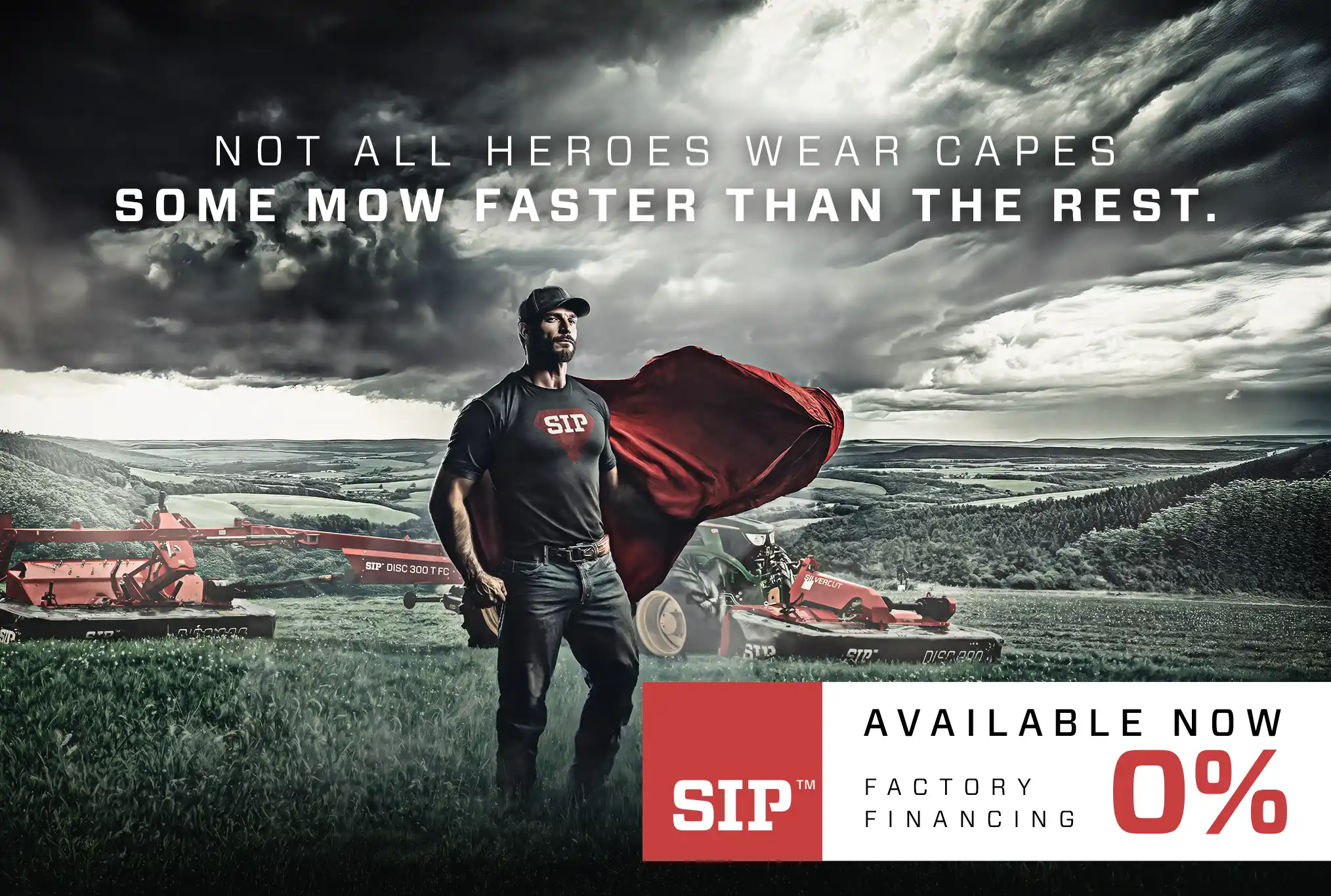
Not every battle in the field is against weeds — sometimes it’s against mediocrity. That’s how SIPerman was born — a hero who brought a cinematic sense of power into the world of agricultural machinery. The project combined the energy and dynamic flair of F1 visuals with the boldness of superhero posters, creating an image impossible to ignore.

Instead of a typical product showcase, it became an icon — a symbol of courage, strength, and precision. SIPerman personified the brand’s values: reliability, passion, and technological edge. The final image blended photomontage, digital painting, and high-end retouching to achieve a truly cinematic look.

Look, on the field! It’s SIPerman!

Made in Brandfarm

Made in Brandfarm

Behind every powerful image lies a spark — a bold idea brought to life through light, texture, and detail. The SIPerman project proved that agricultural marketing can be as thrilling and iconic as any blockbuster poster. Every element — from the cinematic lighting to the subtle red mist — was designed to give SIP’s machinery a larger-than-life presence. It wasn’t just about showing strength; it was about showing character.

Because power alone isn’t enough — you need a story behind it.

Redefining agriculture e-commerce — from brand identity to full e-shop launch

Originally crafted at Brandfarm

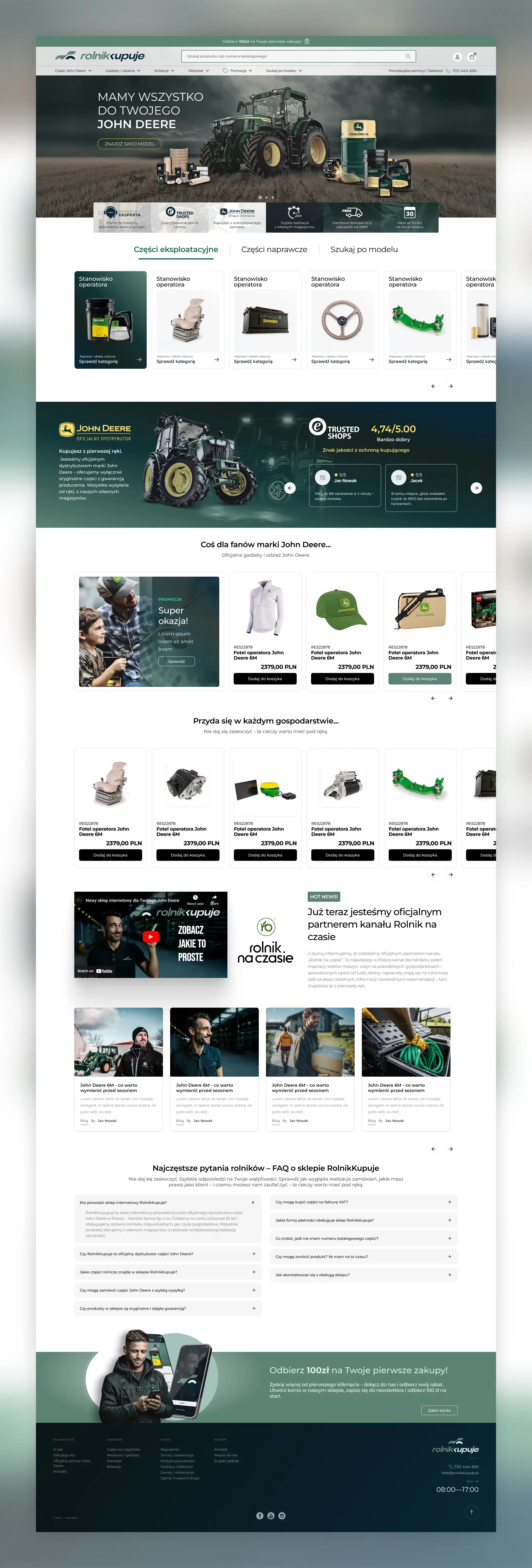
Rolnikkupuje.pl was created as a new e-commerce brand redefining how farmers shop online. From the first sketches of its identity to the full-scale platform launch, the goal was clear — to merge agricultural heritage with digital precision. The result is not just a store, but a complete ecosystem for the modern farmer — where usability meets strong, memorable design.

The visual identity was built around the concept of “Fluid Blocks” — a modular system of soft, interconnected shapes. The idea was to give the tractor a digital, almost app-like look — something that feels modern, tech-driven, yet rooted in agriculture. The logo merges precision and fluidity, creating an abstract machine form that moves forward through design. The color palette — deep navy, mint, and cool green — adds clarity and freshness, while the italic lettering and double-arrow “K” reinforce motion, innovation, and flow.

Redefining agriculture e-commerce

Made in Brandfarm
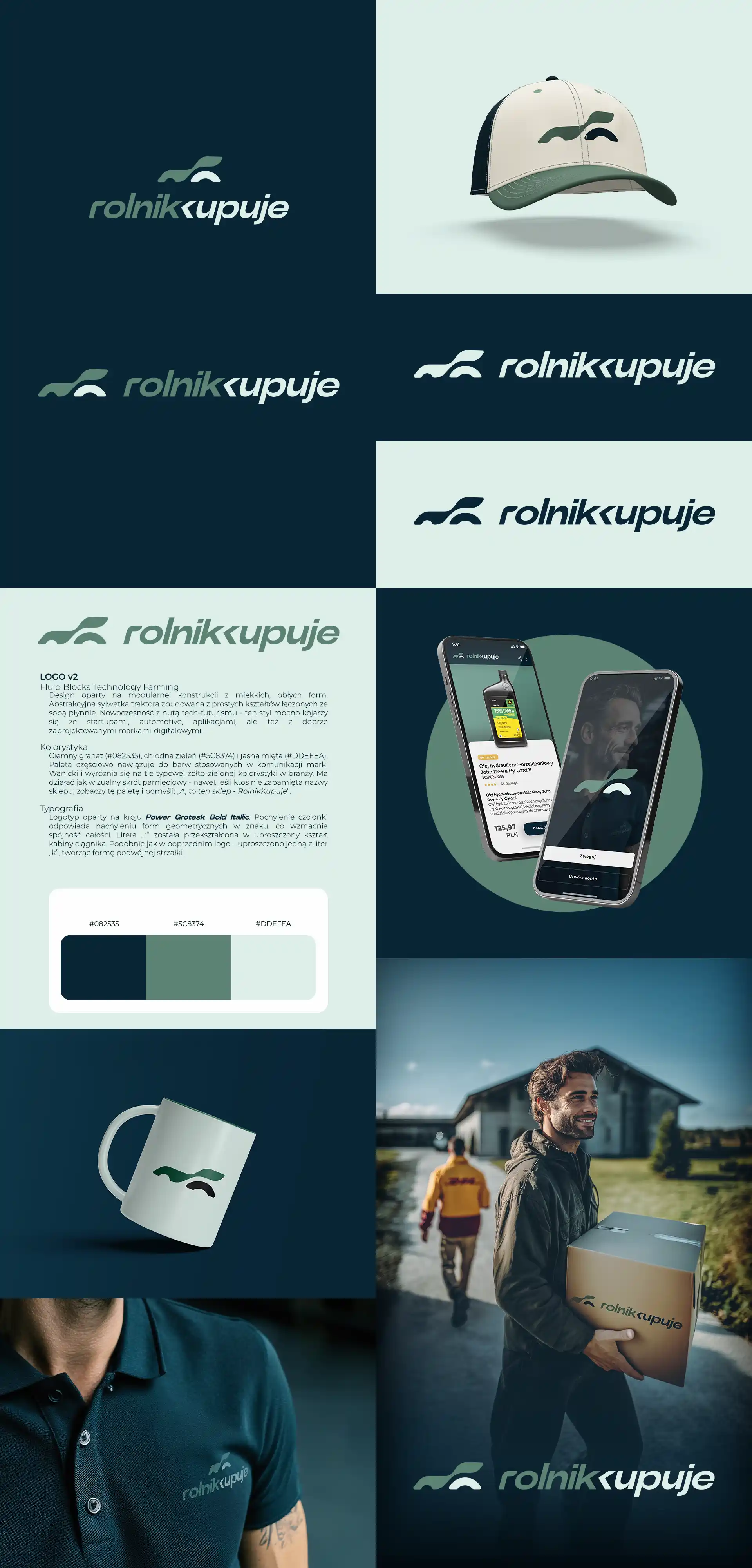
The e-commerce experience was designed from the ground up — starting with UX layouts in Figma and visual exploration in Adobe CC, followed by full prototyping in Webflow. Once the concept was validated, the entire structure was migrated to the production platform. Every detail was refined — from micro-interactions and custom icons to badges and subtle motion effects. Each subpage was designed individually, not duplicated, ensuring a consistent yet distinctive experience. Many of the visual effects were recreated directly in code using HTML, CSS, and JS, allowing for cleaner structure, lighter load, and fully responsive behavior. All assets were optimized for performance — with SVG and WebP replacing traditional PNGs wherever possible. The project also included multiple integrations with external tools and systems, along with light copywriting work to refine messaging. Beyond the website, the visual language extended into social media graphics, posts, and print materials — keeping the brand coherent across all channels.

Made in Brandfarm
Made in Brandfarm

Made in Brandfarm

Made in Brandfarm
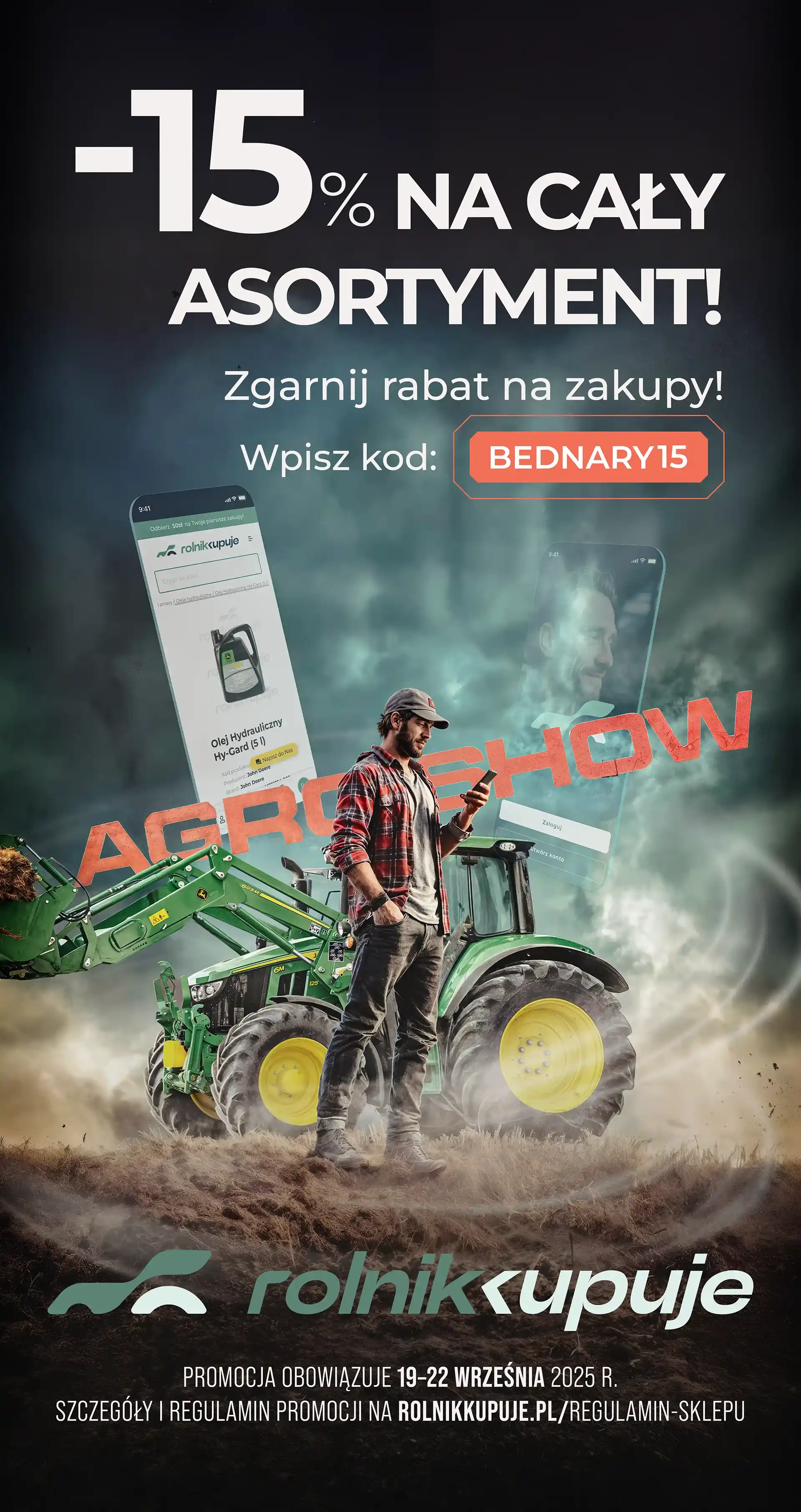
Rolnikkupuje.pl has grown into a complete, consistent brand — from a single idea to a fully realized e-commerce ecosystem. A modern identity, thoughtful design, and clear communication helped create a platform that feels both trustworthy and forward-looking — just like the new generation of farmers it was built for. It’s a project that connects technology with everyday usability, showing that agricultural brands can be both innovative and visually refined. What began as a local initiative has become a benchmark for how modern agro e-commerce can look and feel.

Built to weather any storm — powered by compact John Deere tractors

Originally crafted at Brandfarm

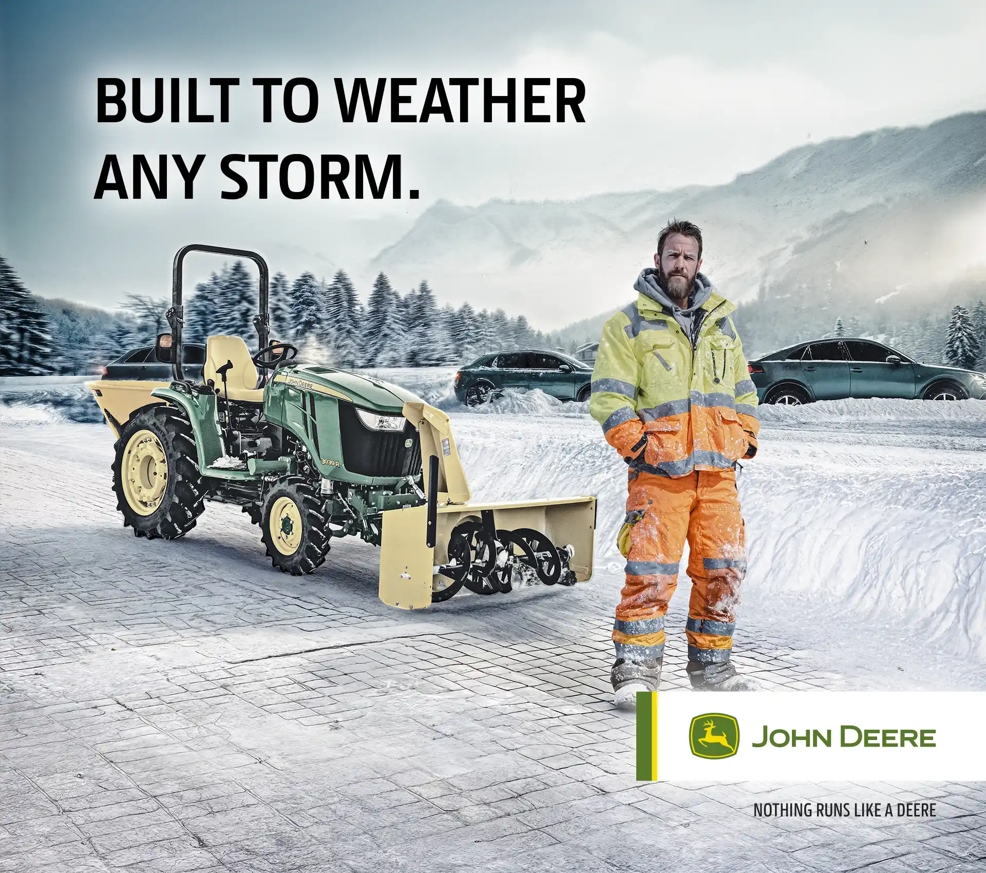
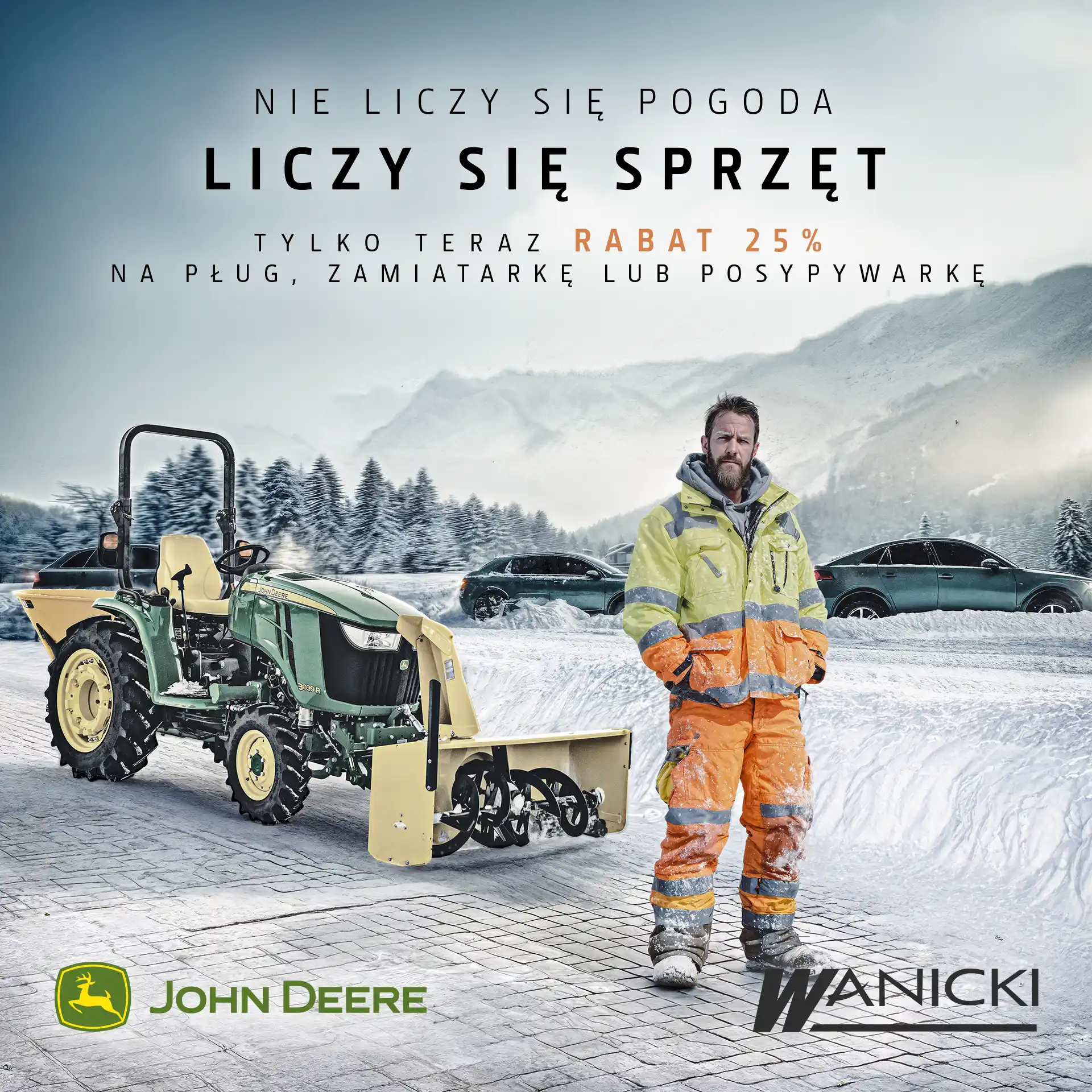
Winter can be tough, but it’s no match for compact John Deere tractors. This campaign, created for an official John Deere dealer, focused on showing how these machines handle everyday challenges — from icy roads to perfectly cleared sidewalks. The first visual plays with contrast — chaos on the street meets precision on the pavement. The tagline “It’s not about the weather, it’s about the equipment” became a playful nod to the stubborn Polish winter and the reliability of JD engineering. Strong lighting, cinematic composition, and realistic snow textures helped create a sense of tension and calm at the same time — turning a simple product shot into a story about confidence and control.

Built to weather any storm

Made in Brandfarm

Made in Brandfarm

Made in Brandfarm

As Jon Snow used to say — “Winter is coming.” But for John Deere, that’s not a warning — it’s just another season to handle. The second key visual connects two worlds — winter and summer — brought together through photomanipulation. It shows how one compact machine can adapt from snow removal to lawn mowing, proving that true performance isn’t seasonal. Dynamic lighting and smooth transitions between the two climates emphasize the idea of versatility and continuity. The line “Ready for every season” summed it up perfectly — practical, versatile, and built to work when others wait for better weather.

Look, on the field! It’s SIPerman! — a heroic twist on agri branding

CREATIVE CONCEPT & VISUAL DESIGN
SIP — “LOOK, ON THE FIELD! IT’S SIPERMAN!”
BRAND FARM ·  2025
CREATIVE CONCEPT & VISUAL DESIGN
SIP — “LOOK, ON THE FIELD! IT’S SIPERMAN!”
BRAND FARM ·  2025

Redefining agriculture e-commerce — from brand identity to full e-shop launch

BRAND IDENTITY & E-COMMERCE DESIGN
ROLNIKKUPUJE.PL — “REDEFINING AGRICULTURE E-COMMERCE”
BRAND FARM ·  2025
BRAND IDENTITY & E-COMMERCE DESIGN
ROLNIKKUPUJE.PL — “REDEFINING AGRICULTURE E-COMMERCE”
BRAND FARM ·  2025

Built to weather any storm — powered by compact John Deere tractors

CREATIVE DIRECTION & PHOTO COMPOSITING
JOHN DEERE — “BUILT TO WEATHER ANY STORM”
BRAND FARM ·  2025
CREATIVE DIRECTION & PHOTO COMPOSITING
JOHN DEERE — “BUILT TO WEATHER ANY STORM”
BRAND FARM ·  2025

Following the Giants — USA 2025. limited-edition event apparel

Originally crafted at Brandfarm

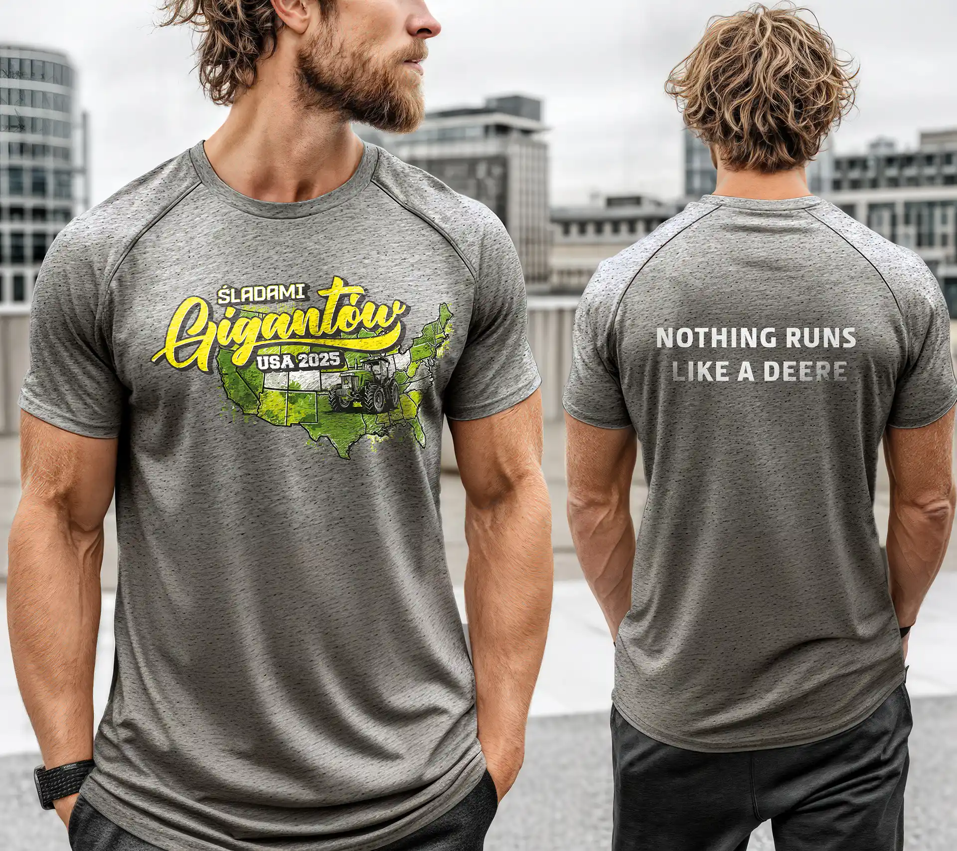
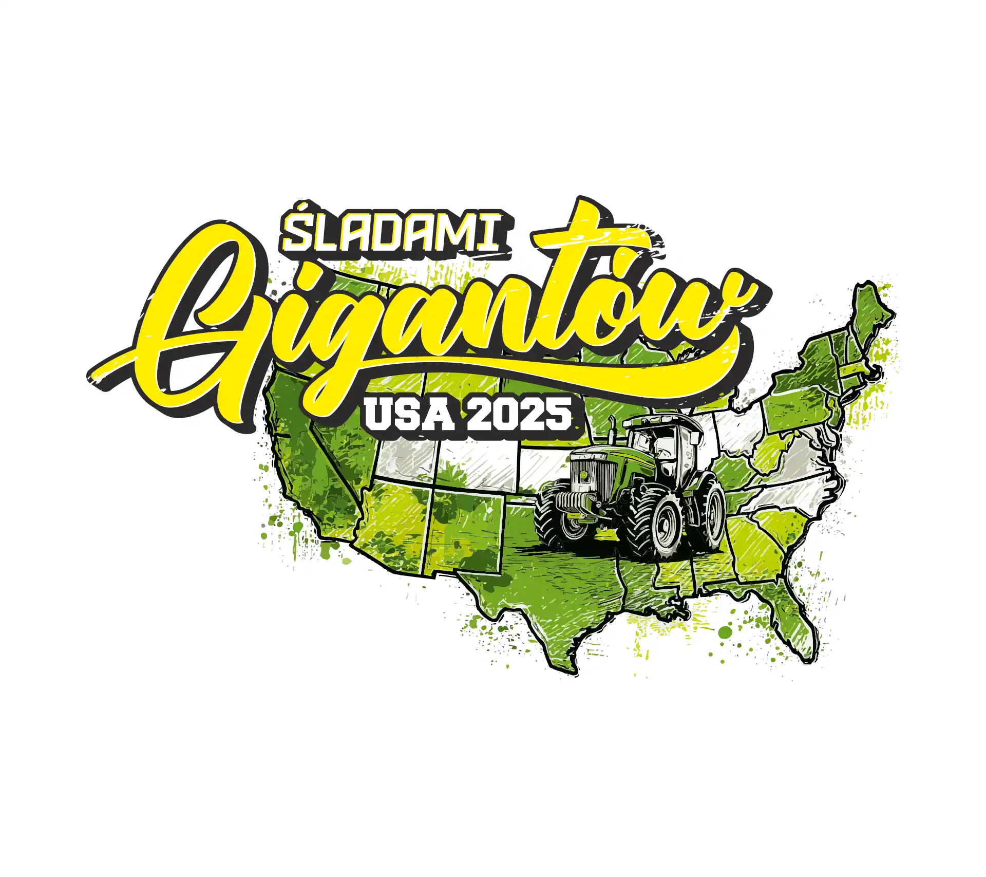
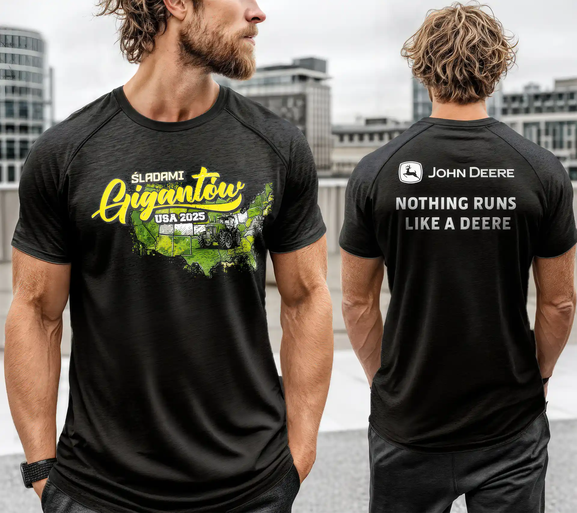
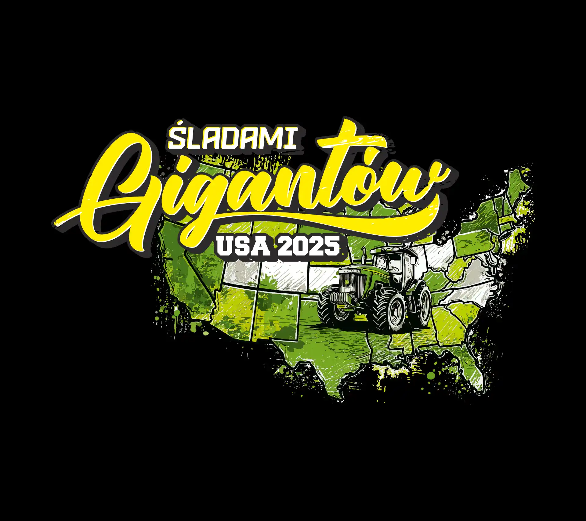
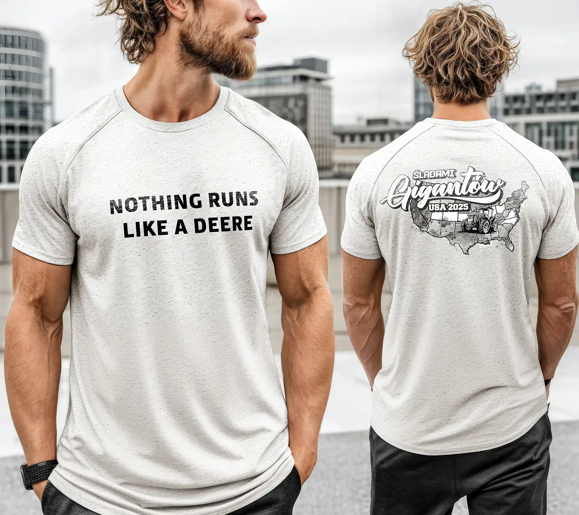
A unique journey for exceptional guests — that’s how the “Śladami Gigantów / Following the Giants” event was born. A special trip to the United States, visiting iconic John Deere factories, showrooms, and the heart of American agriculture. To mark the occasion, we were asked to design a set of limited-edition T-shirts that would capture the spirit of the event — bold, energetic, and distinctly connected to the brand’s roots. Each participant received several shirts in different color versions, combining comfort with collector appeal.

Following the Giants

Made in Brandfarm

Made in Brandfarm

Made in Brandfarm

Made in Brandfarm

Made in Brandfarm

The design combined a hand-drawn map of the USA with a signature John Deere tractor — a visual tribute to both engineering and adventure. The shirts quickly became more than souvenirs; they turned into badges of belonging for everyone who took part in the journey. Looking back, I only regret one thing — I didn’t keep one for myself.

Time to move up — Creative concept for DAF XG Trade-In

Originally crafted at Brandfarm

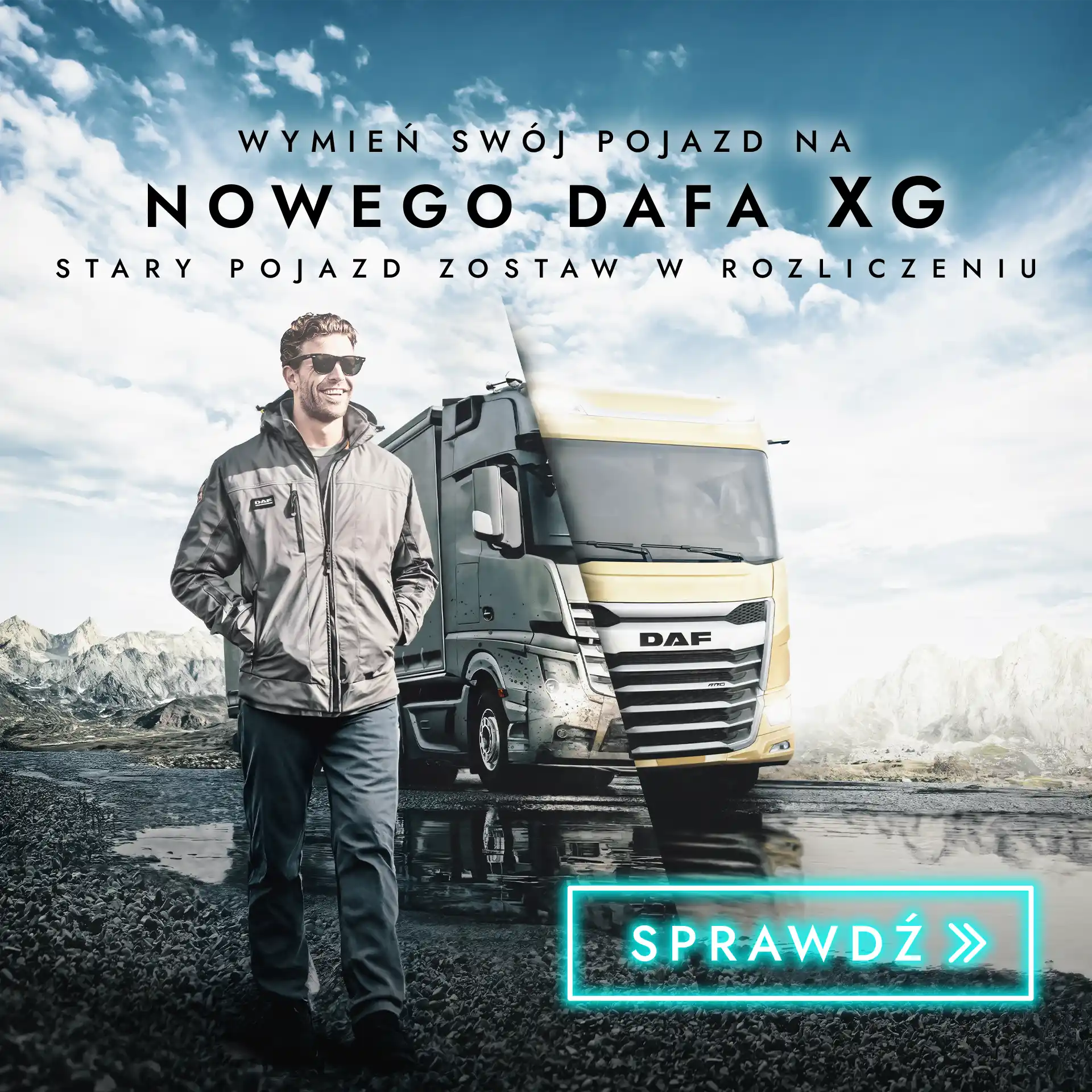
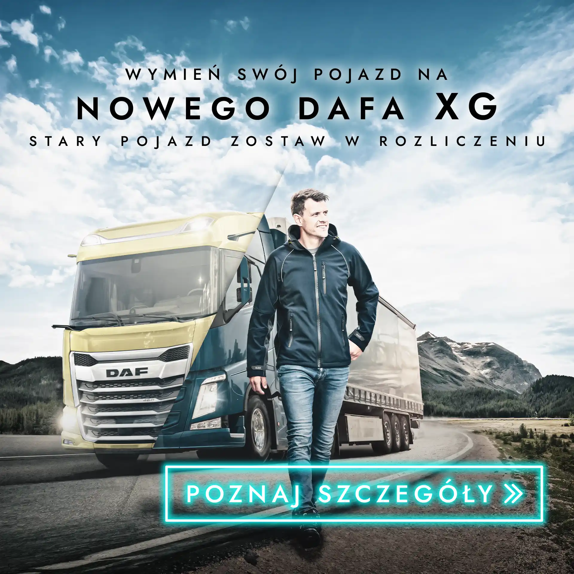
When progress calls, you don’t stand still — you move up. The DAF XG Trade-In campaign was created to promote a smooth transition into the brand’s new generation of trucks. The concept focused on contrast: the rugged reliability of older models meeting the innovation and design of the new XG. The visual split symbolizes that moment of change — one foot in the past, the other confidently stepping into the future. Modern lighting, reflective surfaces and cinematic tones gave the campaign a distinctive look that matched DAF’s evolution.

Time to move up

Made in Brandfarm

Made in Brandfarm

The project combined storytelling with a clean promotional layout — bold, minimal, and focused on emotion rather than excess. Each visual was designed to work both as a standalone banner and a larger trade-in narrative. The result? A campaign that felt fresh, aspirational, and unmistakably DAF. Sometimes the best way to move forward is simply to trade up.

Cultivating joy — a visual campaign with BEDNAR on stage

Originally crafted at Brandfarm

When Bednar machines entered the dealer’s portfolio, the goal was simple — introduce them with a strong, recognizable identity while keeping the original “Joy of Farming” spirit. The visual concept was built around a cinematic composition that merged two separate images into one cohesive scene — connecting people, machines, and the emotion of working the land. The result served as the foundation for further campaign materials, both online and in print.

Cultivating joy

Made in Brandfarm

Made in Brandfarm

The final visuals — including roll-ups and print layouts — kept the recognizable yellow-and-black Bednar aesthetic while introducing a slightly softer, more narrative tone. It was less about the machine specs, and more about showing the human side of modern farming — all within a consistent visual framework adapted for the dealer’s communication.

Because farming isn’t just about machinery — it’s about passion, patience, and pride in every field.

Following the Giants — USA 2025. limited-edition event apparel

VISUAL DESIGN & EVENT IDENTITY
JOHN DEERE — “FOLLOWING THE GIANTS / USA 2025”
BRAND FARM ·  2025
VISUAL DESIGN & EVENT IDENTITY
JOHN DEERE — “FOLLOWING THE GIANTS / USA 2025”
BRAND FARM ·  2025

Time to move up — Creative concept for DAF XG Trade-In

CAMPAIGN CONCEPT & VISUAL STRATEGY
DAF TRUCKS — “TIME TO MOVE UP — XG TRADE-IN”
BRAND FARM ·  2024
CAMPAIGN CONCEPT & VISUAL STRATEGY
DAF TRUCKS — “TIME TO MOVE UP — XG TRADE-IN”
BRAND FARM ·  2024

Cultivating joy — a visual campaign with BEDNAR on stage

VISUAL STORYTELLING & BRAND INTEGRATION
BEDNAR — “CULTIVATING JOY / JOY OF FARMING”
BRAND FARM ·  2025
VISUAL STORYTELLING & BRAND INTEGRATION
BEDNAR — “CULTIVATING JOY / JOY OF FARMING”
BRAND FARM ·  2025

Even the neighbor’s dog stopped barking — John Deere mowers

Originally crafted at Brandfarm

Nothing motivates a purchase quite like a neighbor’s jealousy. The campaign for John Deere proves that the best sales trigger can simply be the silence from the other side of the fence. Lush green, a perfectly trimmed lawn, and a touch of irony were enough to turn a simple mower shot into a story full of emotion — where everyone plays their part: the owner, the neighbor, and even his dog.

From a set of standard John Deere assets, a full series of visuals was created to portray everyday neighborhood moments in a humorous, relatable way. The work included concept development, photo manipulation, image compositing, and detailed retouching to seamlessly merge multiple elements into one coherent scene. Each visual was later paired with lighthearted memes that added a social twist to the campaign — turning simple product images into stories people could actually smile at. Concept, visual design, and post-production by Brandfarm.

Even the neighbor’s dog stopped barking

Made in Brandfarm

Made in Brandfarm

Made in Brandfarm

Made in Brandfarm

Behind the humorous concept lies a simple truth — emotions sell as well as specifications. Instead of focusing on power, speed, or performance, this campaign shows what truly makes people want a John Deere: the feeling of pride when everyone else stops and stares. Neighbor’s envy included with every John Deere mower.

Grab it or lose it — creative campaign for JD 6M clearance

Originally crafted at Brandfarm

Every decision in business comes down to timing — and farming is no different. The John Deere 6M clearance campaign captured that fleeting moment between hesitation and action, where opportunity either slips away or becomes a victory. A cinematic composition, strong contrast, and a lone figure standing next to the machine created a scene that feels more like a movie poster than a product ad.

What began as a seasonal clearance push became a statement about confidence and instinct. Through light, posture, and atmosphere, the campaign invited farmers to see their purchase not as routine, but as a bold move — one that defines who leads and who follows.

The work combined concept development, visual design, and heavy post-production to turn standard product imagery into a dramatic storytelling piece. Created for the 6M series, it connected urgency with aspiration, reminding that some chances only come once. Grab it or lose it — creative campaign for JD 6M clearance.

Grab it or lose it

Made in Brandfarm

Made in Brandfarm

Made in Brandfarm

The John Deere 6M Clearance campaign turned a straightforward sales message into a cinematic expression of strength and precision. The composition — combining the 6M emblem, headline, subline, and the tractor itself — was designed to work like a movie poster, merging brand storytelling with visual impact. Through careful retouching, lighting, and atmosphere, the project captured that decisive moment between hesitation and action — when a purchase becomes a statement.

Each visual was meticulously crafted to highlight not just the machine, but the confidence behind the decision to own it. From art direction and photo manipulation to tone and composition, every frame was built to elevate a limited-time offer into an iconic moment.

Creative direction, visual design & retouching by Brandfarm — 2024.

For those who measure time in hectares — the 360° Rol-Ex experience

Originally crafted at Brandfarm

Rol-Ex, a Polish agricultural brand, proves that precision and innovation don’t stop at the Alps. Their signature cappuccino-colored machines stand out boldly in a world dominated by red, green, and blue — a symbol of courage and creative vision. A brand this confident deserves equally inventive storytelling — and that’s where we come in.

Move around — we’ve got nothing to hide. They say perfection has many sides — so we showed them all. For Rol-Ex, we built a cinematic 360° panorama — printed in a massive, high-resolution format as a wall mural for the brand’s trade show booth. The final artwork spanned nearly 40 feet (12 meters) in width, offering poster-level sharpness and depth — all created from surprisingly small assets, including a single frame taken from a TikTok reel.

The result exceeded expectations — both ours and the client’s. See for yourself — but don’t try to reach the end. It loops forever.

For those who measure time in hectares

Made in Brandfarm

Made in Brandfarm

Made in Brandfarm

What started as a simple wall concept quickly turned into something bigger — a full visual experience that pulled visitors right into the world of Rol-Ex. Every frame was carefully stitched together, color-graded, and balanced to keep that cinematic depth while staying true to the brand’s earthy tones.

The installation didn’t just decorate the booth — it defined it. It gave the space identity, energy, and the kind of atmosphere that makes people stop for a moment longer than they planned.

It turned heads, sparked conversations, and reminded everyone that even in the world of agriculture, design and storytelling matter. Turns out, you don’t need a Swiss watch to measure perfection — just a bit of courage, a good idea, and a lot of pixels. Rol-Ex proved it.

Even the neighbor’s dog stopped barking — John Deere mowers

Grab it or lose it — creative campaign for JD 6M clearance

For those who measure time in hectares — the 360° Rol-Ex experience

Look, on the field! It’s SIPerman! — a heroic twist on agri branding

Originally crafted at Brandfarm

Not every battle in the field is against weeds — sometimes it’s against mediocrity. That’s how SIPerman was born — a hero who brought a cinematic sense of power into the world of agricultural machinery. The project combined the energy and dynamic flair of F1 visuals with the boldness of superhero posters, creating an image impossible to ignore.

Instead of a typical product showcase, it became an icon — a symbol of courage, strength, and precision. SIPerman personified the brand’s values: reliability, passion, and technological edge. The final image blended photomontage, digital painting, and high-end retouching to achieve a truly cinematic look.

Look, on the field! It’s SIPerman!

Made in Brandfarm

Made in Brandfarm

Behind every powerful image lies a spark — a bold idea brought to life through light, texture, and detail. The SIPerman project proved that agricultural marketing can be as thrilling and iconic as any blockbuster poster. Every element — from the cinematic lighting to the subtle red mist — was designed to give SIP’s machinery a larger-than-life presence. It wasn’t just about showing strength; it was about showing character.

Because power alone isn’t enough — you need a story behind it.

Redefining agriculture e-commerce — from brand identity to full e-shop launch

Originally crafted at Brandfarm

Rolnikkupuje.pl was created as a new e-commerce brand redefining how farmers shop online. From the first sketches of its identity to the full-scale platform launch, the goal was clear — to merge agricultural heritage with digital precision. The result is not just a store, but a complete ecosystem for the modern farmer — where usability meets strong, memorable design.

The visual identity was built around the concept of “Fluid Blocks” — a modular system of soft, interconnected shapes. The idea was to give the tractor a digital, almost app-like look — something that feels modern, tech-driven, yet rooted in agriculture. The logo merges precision and fluidity, creating an abstract machine form that moves forward through design. The color palette — deep navy, mint, and cool green — adds clarity and freshness, while the italic lettering and double-arrow “K” reinforce motion, innovation, and flow.

Redefining agriculture e-commerce

Made in Brandfarm

The e-commerce experience was designed from the ground up — starting with UX layouts in Figma and visual exploration in Adobe CC, followed by full prototyping in Webflow. Once the concept was validated, the entire structure was migrated to the production platform. Every detail was refined — from micro-interactions and custom icons to badges and subtle motion effects. Each subpage was designed individually, not duplicated, ensuring a consistent yet distinctive experience. Many of the visual effects were recreated directly in code using HTML, CSS, and JS, allowing for cleaner structure, lighter load, and fully responsive behavior. All assets were optimized for performance — with SVG and WebP replacing traditional PNGs wherever possible. The project also included multiple integrations with external tools and systems, along with light copywriting work to refine messaging. Beyond the website, the visual language extended into social media graphics, posts, and print materials — keeping the brand coherent across all channels.

Made in Brandfarm

Made in Brandfarm

Made in Brandfarm

Made in Brandfarm

Rolnikkupuje.pl has grown into a complete, consistent brand — from a single idea to a fully realized e-commerce ecosystem. A modern identity, thoughtful design, and clear communication helped create a platform that feels both trustworthy and forward-looking — just like the new generation of farmers it was built for. It’s a project that connects technology with everyday usability, showing that agricultural brands can be both innovative and visually refined. What began as a local initiative has become a benchmark for how modern agro e-commerce can look and feel.

Built to weather any storm — powered by compact John Deere tractors

Originally crafted at Brandfarm

Winter can be tough, but it’s no match for compact John Deere tractors. This campaign, created for an official John Deere dealer, focused on showing how these machines handle everyday challenges — from icy roads to perfectly cleared sidewalks. The first visual plays with contrast — chaos on the street meets precision on the pavement. The tagline “It’s not about the weather, it’s about the equipment” became a playful nod to the stubborn Polish winter and the reliability of JD engineering. Strong lighting, cinematic composition, and realistic snow textures helped create a sense of tension and calm at the same time — turning a simple product shot into a story about confidence and control.

Built to weather any storm

Made in Brandfarm

Made in Brandfarm

Made in Brandfarm

As Jon Snow used to say — “Winter is coming.” But for John Deere, that’s not a warning — it’s just another season to handle. The second key visual connects two worlds — winter and summer — brought together through photomanipulation. It shows how one compact machine can adapt from snow removal to lawn mowing, proving that true performance isn’t seasonal. Dynamic lighting and smooth transitions between the two climates emphasize the idea of versatility and continuity. The line “Ready for every season” summed it up perfectly — practical, versatile, and built to work when others wait for better weather.

Look, on the field! It’s SIPerman! — a heroic twist on agri branding

Redefining agriculture e-commerce — from brand identity to full e-shop launch

Built to weather any storm — powered by compact John Deere tractors

Following the Giants — USA 2025. limited-edition event apparel

Originally crafted at Brandfarm

A unique journey for exceptional guests — that’s how the “Śladami Gigantów / Following the Giants” event was born. A special trip to the United States, visiting iconic John Deere factories, showrooms, and the heart of American agriculture. To mark the occasion, we were asked to design a set of limited-edition T-shirts that would capture the spirit of the event — bold, energetic, and distinctly connected to the brand’s roots. Each participant received several shirts in different color versions, combining comfort with collector appeal.

Following the Giants

Made in Brandfarm

Made in Brandfarm

Made in Brandfarm

Made in Brandfarm

Made in Brandfarm

The design combined a hand-drawn map of the USA with a signature John Deere tractor — a visual tribute to both engineering and adventure. The shirts quickly became more than souvenirs; they turned into badges of belonging for everyone who took part in the journey. Looking back, I only regret one thing — I didn’t keep one for myself.

Time to move up — Creative concept for DAF XG Trade-In

Originally crafted at Brandfarm

When progress calls, you don’t stand still — you move up. The DAF XG Trade-In campaign was created to promote a smooth transition into the brand’s new generation of trucks. The concept focused on contrast: the rugged reliability of older models meeting the innovation and design of the new XG. The visual split symbolizes that moment of change — one foot in the past, the other confidently stepping into the future. Modern lighting, reflective surfaces and cinematic tones gave the campaign a distinctive look that matched DAF’s evolution.

Time to move up

Made in Brandfarm

Made in Brandfarm

The project combined storytelling with a clean promotional layout — bold, minimal, and focused on emotion rather than excess. Each visual was designed to work both as a standalone banner and a larger trade-in narrative. The result? A campaign that felt fresh, aspirational, and unmistakably DAF. Sometimes the best way to move forward is simply to trade up.

Cultivating joy — a visual campaign with BEDNAR on stage

Originally crafted at Brandfarm

When Bednar machines entered the dealer’s portfolio, the goal was simple — introduce them with a strong, recognizable identity while keeping the original “Joy of Farming” spirit. The visual concept was built around a cinematic composition that merged two separate images into one cohesive scene — connecting people, machines, and the emotion of working the land. The result served as the foundation for further campaign materials, both online and in print.

Cultivating joy

Made in Brandfarm

Made in Brandfarm

The final visuals — including roll-ups and print layouts — kept the recognizable yellow-and-black Bednar aesthetic while introducing a slightly softer, more narrative tone. It was less about the machine specs, and more about showing the human side of modern farming — all within a consistent visual framework adapted for the dealer’s communication.

Because farming isn’t just about machinery — it’s about passion, patience, and pride in every field.

Following the Giants — USA 2025. limited-edition event apparel

Time to move up — Creative concept for DAF XG Trade-In

Cultivating joy — a visual campaign with BEDNAR on stage